Basic figure creation in R with ggplot
Scientific programming
R is an open source programming language with a strong use in data analysis. Generally it is used more often for open statistical tools. It is used by some in the Geoscience community.
Python is another widely used programming language in Geosciences. It has similar capabilities to R but different strengths.
Much of the most useful scientific programming you are likely to do focuses on data reduction and processing to test specific hypotheses. Creating figures using code in either R or Python allows you to design your data display while collecting data. You can also be sure to link the data to the figure easily and in a reproducible way.
Lab tasks
In this lab, you will be making figures using randomly generated data and publicly available geology data. I have code chunks embedded below that you can copy/paste into your own instance of R Studio and then execute.
Loading packages
R is powerful because people make and share packages of code that can streamline doing scientific tasks. Packages contain smaller functions that are self-contained and accomplish a set of specific tasks. For example, a very simple function is defined below.
AddTwo <- function(x){
  y <- x + 2
  return(y)
}

AddTwo(3)
## [1] 5This function takes a number given to it, X, and returns that number plus two. Other functions have more in depth operations, but ideally code is written to execute the smallest steps possible for each action to improve human readability and ease troubleshooting.
We will use the packages below. They need to be opened after installing. Official packages for R are shared on CRAN. The functions below install and load the packages. The package ggplot2 uses the ‘grammar of graphics’ to make complex plots efficient to code. The package tidyverse includes utilities for data summarization and transformation. For additional documentation about different commonly used R functions look at these cheetsheets.
# install.packages("ggplot2")
# install.packages("tidyverse")
library(ggplot2)
library(tidyverse)
Making figures
The simplest figure we can make is a crossplot with X and Y data. Below is an example using randomly generated X and Y points. This plot and dataset use only the basic functions included with R (commonly known as Base R).
Base R
N <- 100
X <- rnorm(n = N, mean = 5, sd = 2)
Y <- rnorm(n = N, mean = 8, sd = 3)

plot(x = X, y = Y)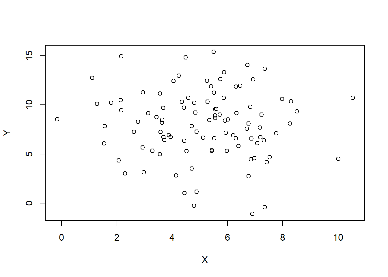
Simple crossplot with ggplot
To do this same thing with ggplot2 we use a slightly different syntax for the figure. First we must make a data frame with our data (think excel table).
RandomData <- as.data.frame(cbind(X,Y))

ggplot(data = RandomData, aes(x = X, y = Y))+
  geom_point()+
  theme_bw()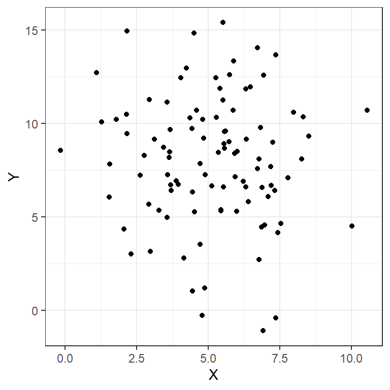
More complex with ggplot
Let’s get more complicated, because we often want to use data containing multiple axes (e.g. location, time). Using software other than Excel makes these sorts of figures much easier to create. My preferred method is using the ggplot and associated packages for R. With ggplot, the grammar of graphics guides the creation of a plot and allows users to trace the source of data and make adjustments quickly. There are also preset themes for ggplot that quickly adjust the overall style of figures for a more professional and consistent look.
In the code below we use the dataframe RandomData to feed into creating the plot. We set plot aesthetics using aes and name individual parameters we want to include in the plot. Here we use x, y, color, and shape because we are interested in seeing all of these permutations in our crossplot. We then indicate what type of plot we want to make using geom_point to indicate a scatterplot. The code could stop here, but I also adjust the size of the points with size = 2 and adjust the theme of the plot using theme_bw(). Note that each adjustment is included through the use of a + after the previous component of the plot.
Time <- 1:N
Site <- sample( LETTERS[1:4], 50, replace=TRUE, prob=c(0.2, 0.2, 0.4, 0.02) )

RandomData <- data.frame(X,Y, Time, Site)

ggplot(data = RandomData, aes(x = X, y = Y, color = Time, shape = Site))+
  geom_point(size = 2)+
  theme_bw()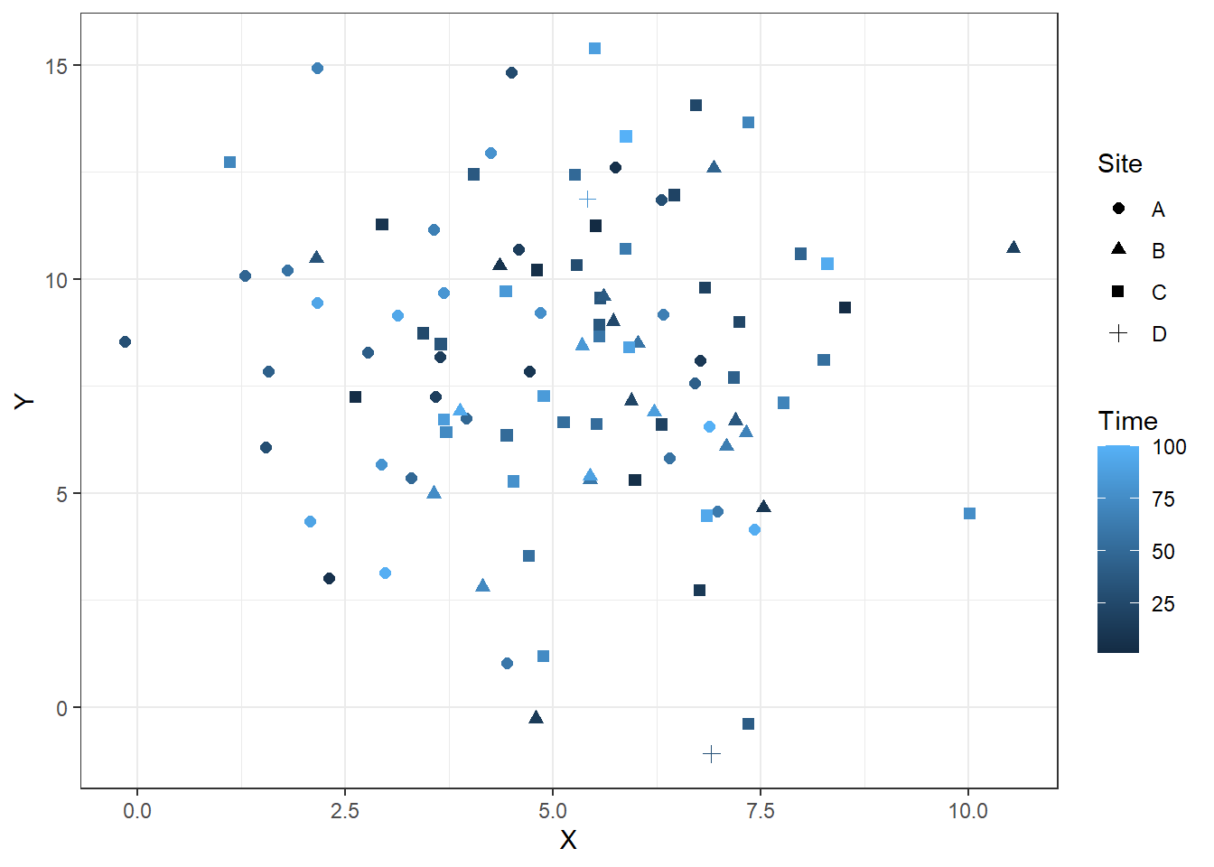
Time series ggplot
It is also easier to create time series plots with this. Below, I add lines that connect the points from each site. Note that I use both geom_point and geom_line to create layered lines and points. If you use one or the other you will only get one or the other.
ggplot(RandomData, aes(x = Time, y = Y, color = Site))+
  geom_point(size = 2)+
  geom_line()+
  theme_bw()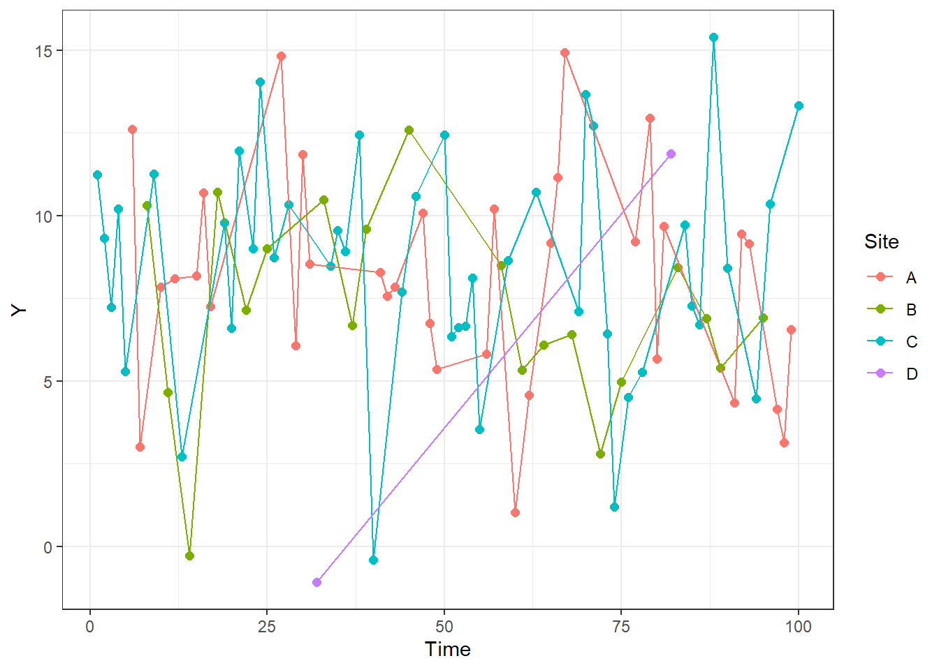
Grain size analysis
We have estimated and qualitatively described grain sizes so far in class. Quantitative measurements can be important for monitoring processes in environments and subdividing paleoenvironments. We will likely talk about this more, but I wanted to add a crash course in it with our lab creating figures.
As with any population of measurements, there are multiple parameters than can be extracted from the measurement of a single variable within a sample. Below are aspects of distributions that are used to describe sediment size distributions.
Descriptive statistics
Mean
Sum of all values divided by the number of values.
Standard deviation
Description of how narrowly distributed the data are. Calculated based on distance of individual analyses from the mean.
Skew
Can be interpreted based on the difference between the mean and the median of the distribution. The mean is displaced towards the longer tail of the distribution.
Kurtosis
Increasing kurtosis is flattening the distribution. Higher kurtosis is more width and less hight near the mean.
Below is an example of a probability distribution based on the random data. Blue vertical lines are equal to two times the standard deviation and encompass 95% of the dataset. The black vertical line is the median value and the red vertical line is the mean.
ggplot(RandomData, aes(x = X))+
  geom_density()+
  geom_vline(aes(xintercept = mean(X)), color = "red")+
  geom_vline(aes(xintercept = median(X)), color = "black")+
  geom_vline(aes(xintercept = mean(X)+2*sd(X)), color = "blue")+
  geom_vline(aes(xintercept = mean(X)-2*sd(X)), color = "blue")+
  theme_bw()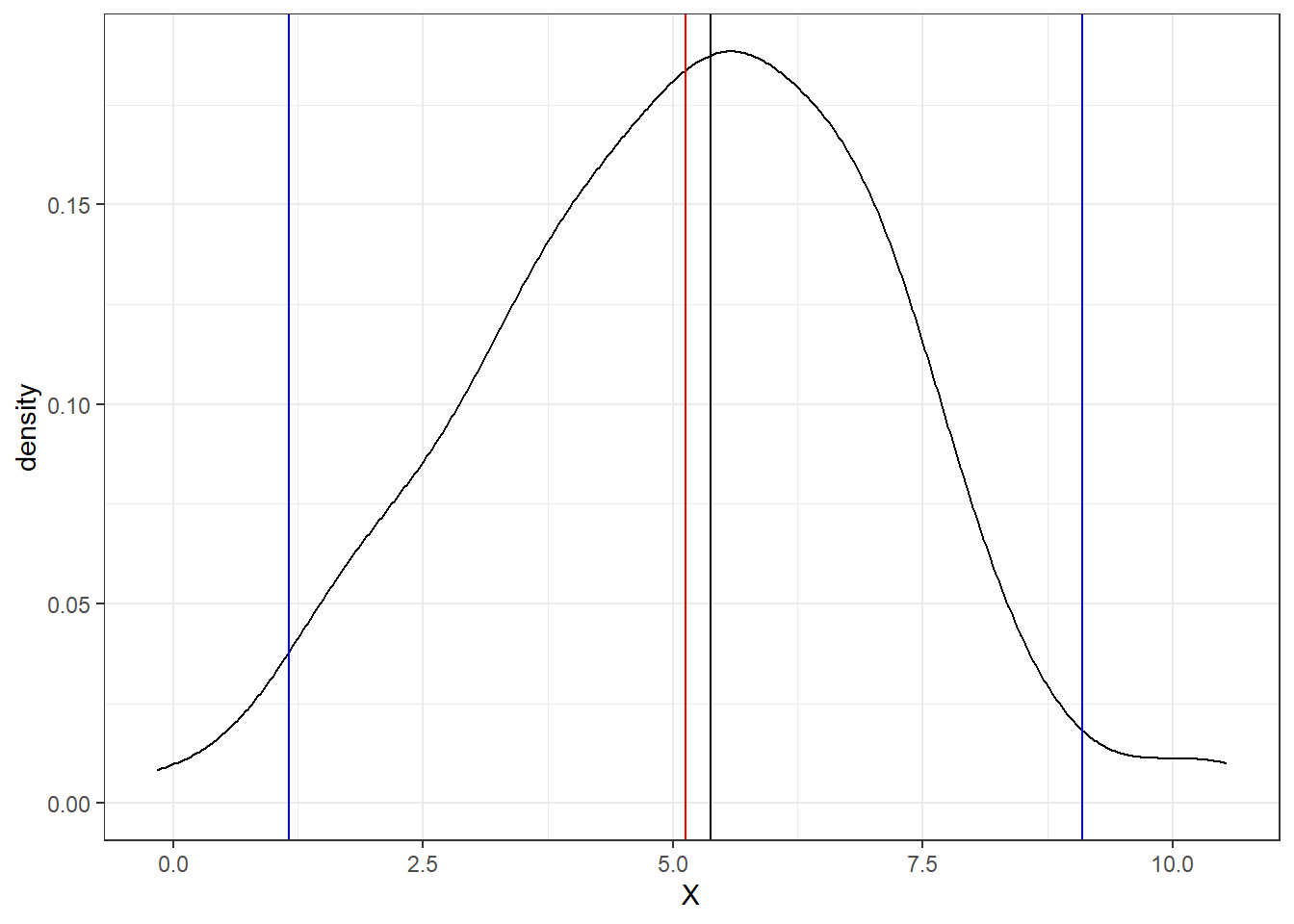
Real datasets
Let’s load some sediment size datasets now.
GrainSize<-read_delim("https://www.ngdc.noaa.gov/mgg/geology/data/g00127/g00127interval.txt", delim = "\t")

GrainSize$device <- as.factor(GrainSize$device)

GrainSize <- GrainSize[grepl("grab", GrainSize$device),]
The first function above downloads, parses, and incorporates data into R all within the function. You can view other important pieces of the dataset with the following. One column, the device column is changed to a factor and then we select only those grain size analyses that are from grab samples using a regex match.
If you need to figure out what a function does, you can enter the name of the function with a question mark in front of it into your console and documentation will be opened. For example ?read_delim() opens the documentation for the function read_delim. If you do not know what needs to be entered use ?? in front of a simple search to look through all documentation for a useful function.
The function below, colnames, returns a vector of the column names.
colnames(GrainSize)## [1] "mggid" "ship" "cruise"
## [4] "sample" "device_code" "device"
## [7] "subcore" "interval" "replicate"
## [10] "analysis_type" "depth_top_cm" "depth_top_mm"
## [13] "depth_bot_cm" "depth_bot_mm" "test_date"
## [16] "test_time" "total_weight" "coarse_meth"
## [19] "fine_meth" "coarse_fine_boundary" "coarse_boundary"
## [22] "fine_boundary" "pct_coarser" "pct_finer"
## [25] "pct_gravel" "pct_sand" "pct_silt"
## [28] "pct_clay" "pct_mud" "usc_gravel"
## [31] "usc_sand" "usc_fines" "meth_description"
## [34] "mean_mm" "mean_phi" "median_phi"
## [37] "modal_phi" "skewness" "kurtosis"
## [40] "std_dev" "sort_coeff" "interval_comments"ggplot(GrainSize, aes(x=median_phi, y=mean_phi, color = skewness))+
geom_point()+
theme_bw()## Warning: Removed 5347 rows containing missing values (geom_point).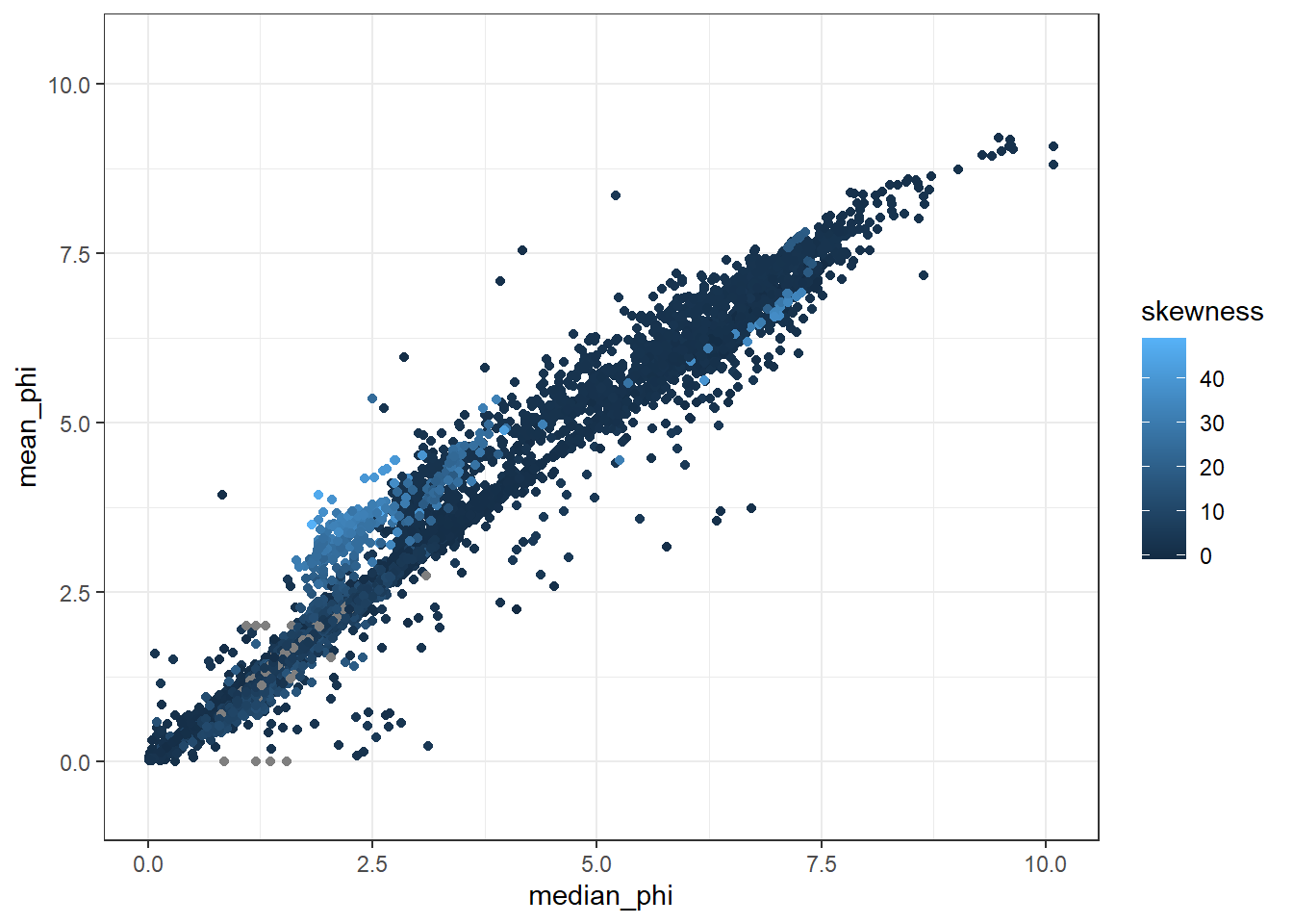
Combining datasets
In the following code chunk, we download the location data, then create smaller dataframes of grain size and location to combine.
We use the logical test of is.na to determine if an individual entry is blank. To only select non-blank entries, we use the ! operator, that makes the logical test is not NA.
The merge function combines both datasets using a few columns so we have unique locations. This allows us to start plotting grain size information, mean_phi for instance, against other parameters like water_depth.
I then plot up the data with a point cloud showing the relationship between the standard deviation of the data and the mean grain size.
Location<-read_delim("https://www.ngdc.noaa.gov/mgg/geology/data/g00127/g00127sample.txt", delim = "\t")##
## -- Column specification --------------------------------------------------------
## cols(
## .default = col_character(),
## device_code = col_double(),
## year = col_double(),
## lat = col_double(),
## lon = col_double(),
## water_depth = col_double(),
## core_length = col_double(),
## comments = col_logical()
## )
## i Use `spec()` for the full column specifications.## Warning: 17970 parsing failures.
## row col expected actual file
## 1 -- 25 columns 26 columns 'https://www.ngdc.noaa.gov/mgg/geology/data/g00127/g00127sample.txt'
## 2 -- 25 columns 26 columns 'https://www.ngdc.noaa.gov/mgg/geology/data/g00127/g00127sample.txt'
## 3 -- 25 columns 26 columns 'https://www.ngdc.noaa.gov/mgg/geology/data/g00127/g00127sample.txt'
## 4 -- 25 columns 26 columns 'https://www.ngdc.noaa.gov/mgg/geology/data/g00127/g00127sample.txt'
## 5 -- 25 columns 26 columns 'https://www.ngdc.noaa.gov/mgg/geology/data/g00127/g00127sample.txt'
## ... ... .......... .......... ....................................................................
## See problems(...) for more details.GrainLocation <- merge(GrainSize, Location, by = c("mggid", "ship", "cruise", "sample"))
ggplot(GrainLocation[GrainLocation$water_depth<500,], aes(x = mean_phi, y = std_dev, color = water_depth))+
geom_point()+
theme_bw()## Warning: Removed 4346 rows containing missing values (geom_point).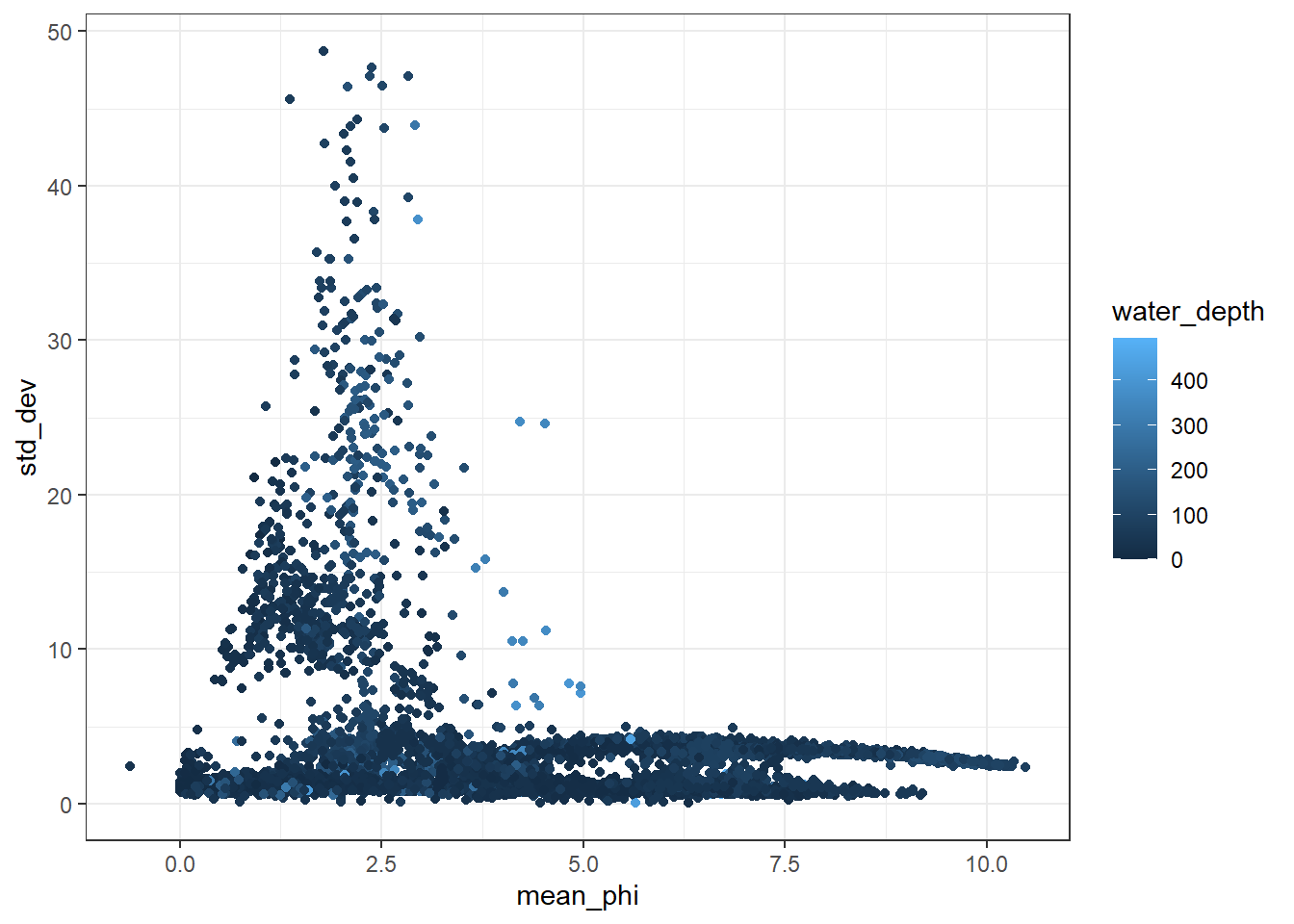
Benjamin J. Linzmeier
Assistant Professor of Earth Sciences
My research interests include biomineralization and geochemistry of sedimentary rocks and fossils.